Purpose of iShop Project
iShop is a grocery shopping and booking app for the UAE market. The app offers a quick and easy way for people to order their food in restaurants. And specialized offers for homemade small food businesses.
Problem: A Localized Design
iShop found a gap in the online market. The simple question was: What if someone wanted to order products from multiple stores at once
Each store offered a delivery service but the timing of delivery for each store was different. Moreover, each store charged a small fee for delivering the goods. The cost doubled when a person was ordering products from multiple stores. The solution was simple. Make a simple app where riders can take orders from all the stores in the area and deliver them to the user’s doorstep.
The design of the app needed to be simple so that everyone can understand the app really quickly.
Process: Minimalistic Design
We designed the app in a way so that users can quickly download the app, and get themselves familiar along the way. The design had minimum steps. A user could sign-in, sign-up easily, order products within seconds, and that is it. We also created a complete profile for the user so that they have ratings available.
The same was done for riders as people who ordered products could rate the riders based on their behavior.
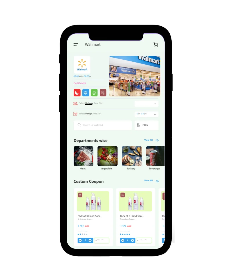
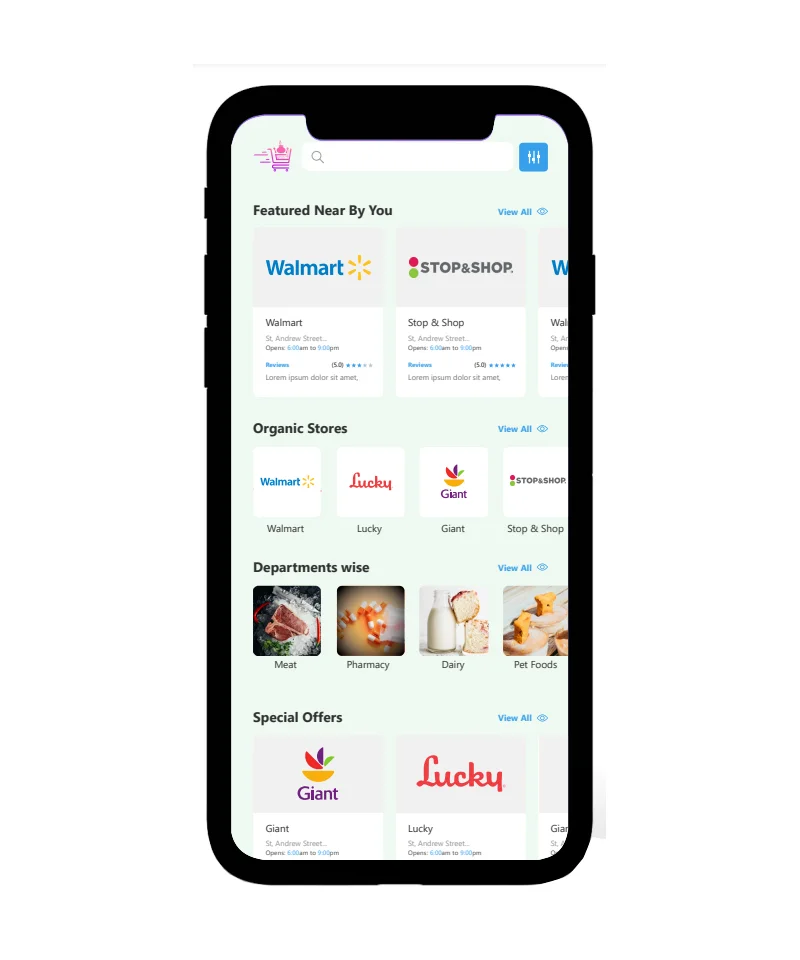
The iShop team approved the following design because of the simplicity it entails. The shops are available on the home screen after a user signs-in. Users can even check the products they want to order by directly clicking on the store’s menu or account.
iShop uses an automated feed directly from the store that is added to the shop on a regular basis.
User Experience Points:
People want simple and quick apps. We made it a single-step process for them to get to the action screen
They can sign-in, sign-up by using social credentials like Google or Facebook
Everything is self-explanatory. They just click on the sign-up button and a verification code is sent to their screen
Easy navigation of the app ensures that users always get to the store easily
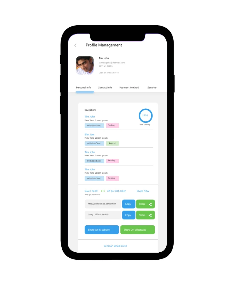
Each user has a profile available that has both public and private views.
Ratings of users, riders, and even stores are displayed on top of the screen
User Interface Points:
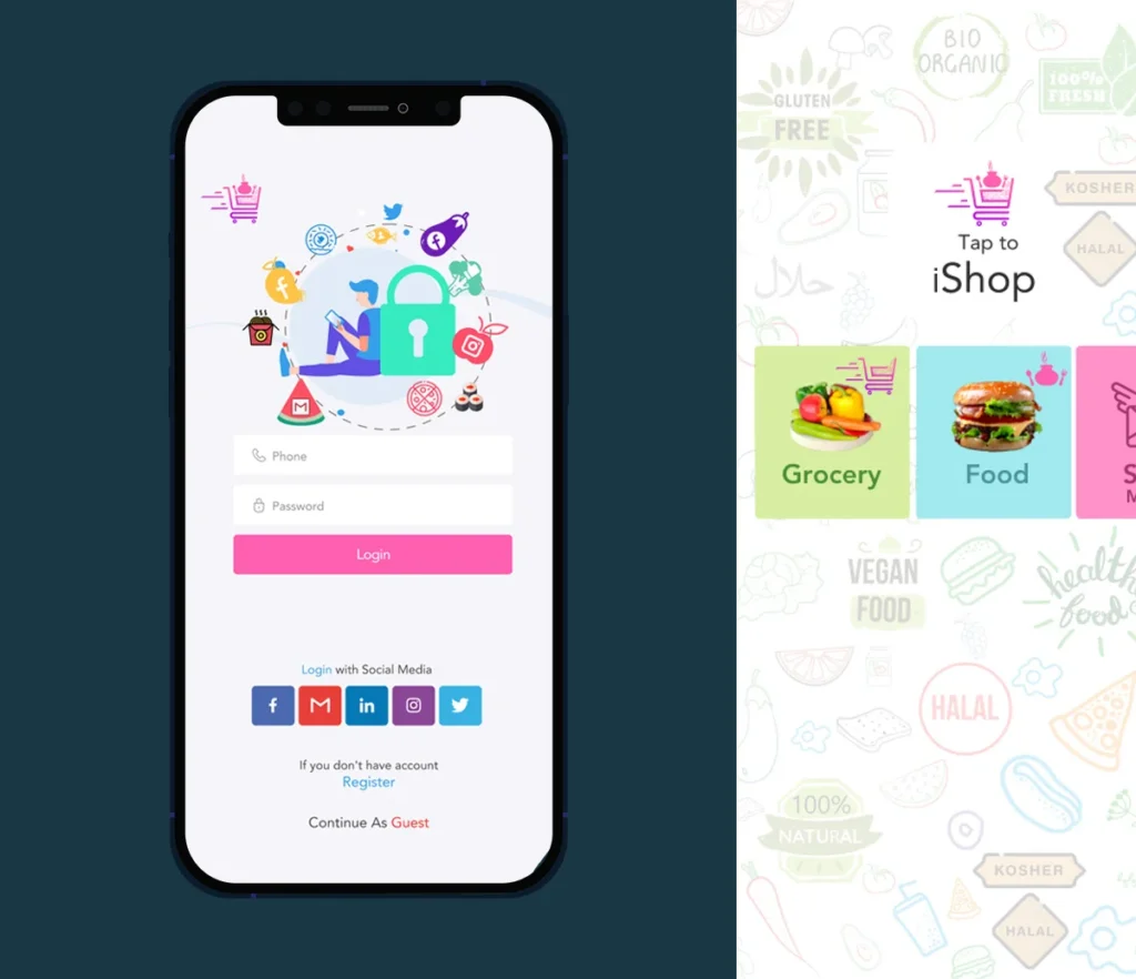
A 3-step process is used. User is taken from the intro screen to the action screen (where he can shop) with 3 clicks.
All top stores are shown on the home screen. Users can also find more stores when they click on ‘More’ or check stores from the Menu screen.
Solution
The intro screen shows the user what services the app offers. Since the user will be downloading the app directly from the Play Store or Apple App Store, they can easily tap the app and get to the products.
The theme mostly has green color because of the ‘Vegan’ ‘Grocery’ and ‘Vegetable’ shopping that most people would want to do with it.
Users can order products easily by clicking on shop-now and paying for the products. Moreover, they can also order directly on the merchant website, and upload the receipt with ‘Take away’ option selected so that iShop riders can pick the orders.
Moreover, from booking buses to making appointments, users can do all that with a few clicks while remaining on the same activity screen.